New Software design - Part 1
Why the BVQ° server got a new look & feel
15.07.2024 - Team BVQ°
Originally developed for internal use, the applications within BVQ° have steadily grown, evolved, and been enhanced with new features since its market launch. Customer requirements and the drive for optimization have always been at the forefront. However, this evolution has also led to increased complexity and size of the software, bringing new challenges - especially in terms of usability.
This blog series offers a deep dive into the new BVQ° design, showcasing helpful features, best practices, and the new workflow of our optimized interface.
In this first part, we’ll explore the changes to the home screen, followed by insights into LDAP integration, filtering, search and tagging functions, and the guided creation of alert rules.
What has changed?
The BVQ° Server UI has been completely redesigned - streamlined and improved in many ways. Numerous new features have been added and placed in optimal locations to ensure easier and more targeted use.
- Why did we take this path with the BVQ° Server?
- Who contributed to this process?
- What benefits does this offer our customers?
Each BVQ° function (e.g., System Health Map, Alerting, Reporting) was initially developed and integrated individually. While many users became familiar with the interface, some elements were not very intuitive, and certain settings were hard to find. Through intensive customer surveys and support feedback, we identified significant optimization potential, which has now been implemented in version 2024.H1.1.
New user guidance, features & benefits
The new BVQ° Server stands out with a clear and well-structured layout. The top priority was to make applications and their settings easily accessible. Where possible, guided workflows help users achieve their goals - such as creating an alert rule. The navigation bar, highlighted in green on the left side, has been reduced to four main areas:
- Home screen configuration
- Scanner settings
- Working with Alerting and the System Health Map (SHM)
- Reporting tools
Less frequently used items have been moved to the “Support” and “Admin” sections at the bottom.
Home is where your System Health Map is
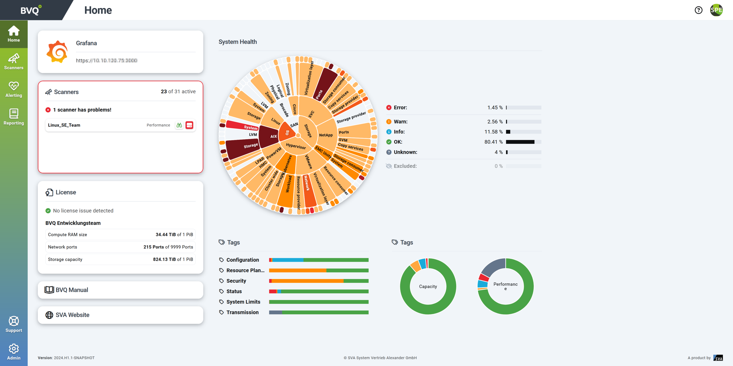
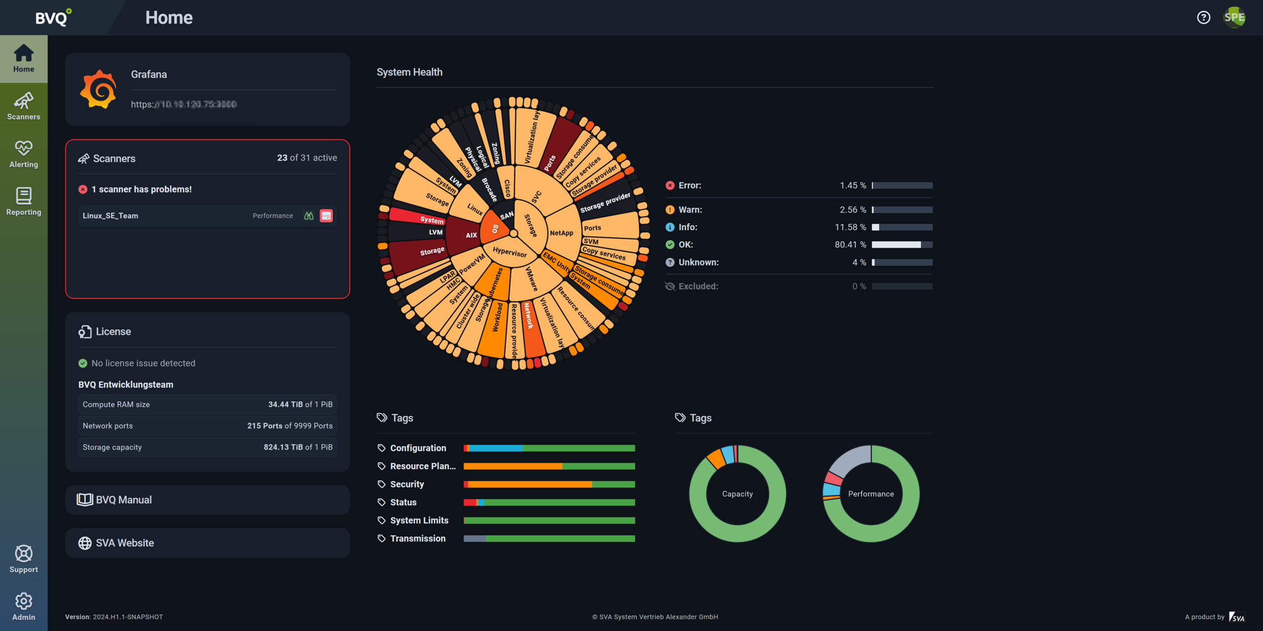
A key aspect of the redesign was improving the home screen. Users can now build and use custom dashboards tailored to their needs. Each user can create a personalized view and choose between light or dark mode:

Fig. 1: Lightmode

Fig. 2: Darkmode
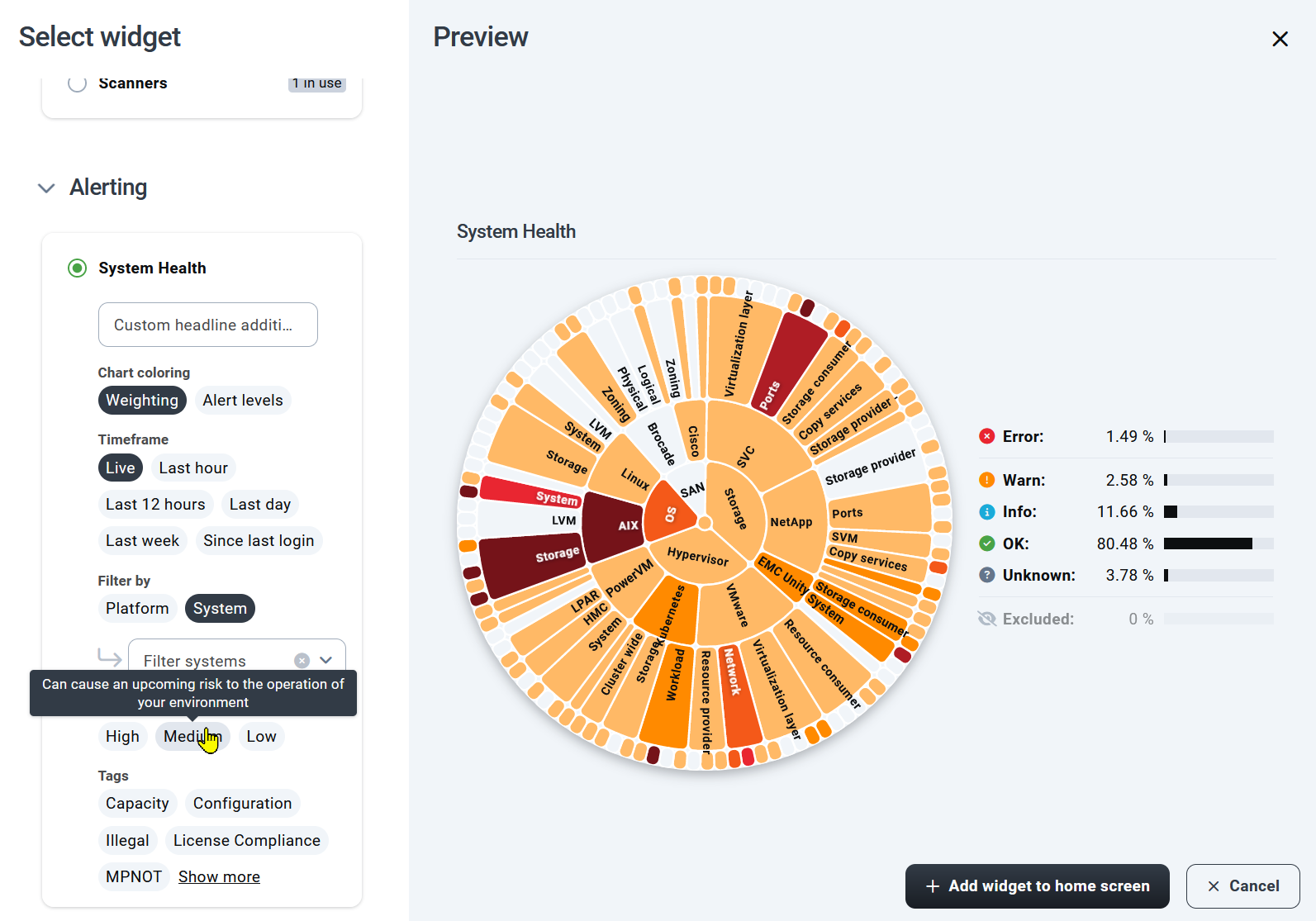
This overview can be customized using freely configurable widgets, which are saved per user. When the UI is reopened, the personalized home screen is restored. Various widget sizes and presets are currently available. Widgets can contain simple elements like links to websites or more complex displays. For example, the SHM can be filtered to show only the most relevant information at a glance. Despite this flexibility, widget settings remain simple and intuitive.
In the image “System Health Map display with filters”, you can also see the new tagging feature, which makes it easier to find specific rules or rule sets and allows sorting by different groups.

Figure 3: System Health Map display with filters