New design - Part 2
Optimized color scheme alerting
15.08.2024 - Team BVQ°
When looking at the new Systems Health Map (SHM), you’ll notice a different visual approach. The previously used colors and messages—red (Error), yellow (Warning), blue (Info), and green (OK)—seem to have disappeared. And there’s a good reason for that.
As mentioned in the previous blog post, a customer survey revealed that users prefer a display that puts greater focus on problematic areas. The new design ensures that it’s immediately clear where action is needed. The result is a “weighted” layout for the SHM, which intentionally omits the green (OK) status. This gives users a direct view of what matters most and helps them better identify and prioritize issues.
Additionally, each alert rule now has a severity weighting represented by a color scheme. This allows for more granular differentiation of issues across grouped rules. For example:
- Orange indicates a Warning
- Red indicates an Error
The intensity of the color reflects the severity level. A deep red signals a critical issue, while a light orange suggests a less severe problem that doesn’t require immediate action.
If users prefer the previous display, they can still switch back. This is done under “Chart coloring”, where you can choose between “Weighting” (new logic) and “Alert levels” (classic view).

Figure 1: Comparison of display options using “Weighting” (new) vs. “Alert levels” (old)
How To: The new alerting and its benefits for users
With the new UI, no functionality has been removed - in fact, new features have been added and integrated in a user-friendly way to avoid clutter.

Figure 2: Alerting view with weighted System Health Map display
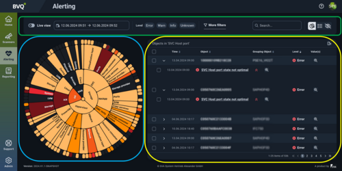
Figure 3: Focus areas of the alerting interface
The new alerting layout in the BVQ° UI is divided into three main areas, as color-coded in the illustration:
- Green area: Settings for defining the time range, filter options, search function and SHM in table view
- Blue area: The SHM itself, dynamically shaped by filters, time range and search algorithms
- Yellow area: The number of objects based on the selected alert rules
Tips for data analysis

Fig. 4: Target-oriented analyzis options
Tipps zur Auswertung der Daten
- The outer edge of the SHM represents a group of objects, such as SVC nodes, Cisco SANs, or VM hosts. In the example, the group of “SVC Host” objects and their current health status is shown.
- If these objects are also evaluated by other rules, the results are displayed beneath the object. In this case, the hosts are monitored by three additional rules.
- The severity of each rule or result is indicated by the following symbols:
- ^ High
- = Medium
- v Low
- The magnifying glass icon provides detailed information about the specific check.
- Clicking the rule link shows the timeline and status of all objects within that rule, along with a list of all affected objects.

Figure 5: Partial view of a rule evaluation
Conclusion
The introduction of the new color logic makes it easier for users to monitor their IT infrastructure. The ability to weight problem areas provides a clear view of where immediate action is needed and which issues can be addressed later. This enables smarter prioritization of administrative tasks, leading to more efficient planning and better prevention of system outages.
Many important new features have already been integrated into the BVQ° Server. Upcoming blog posts will provide more insights into:
- LDAP integration
- Documentation
- Targeted creation of rules and reports
- Tagging
- Search functionality across all areas
If you have questions about the new BVQ° Server UI or its configuration options, feel free to contact us. More details and blog posts can be found in our BVQ° WIKI.