NEW DESIGN - PART 2: OPTIMIZED COLOR SCHEME & ALERTING

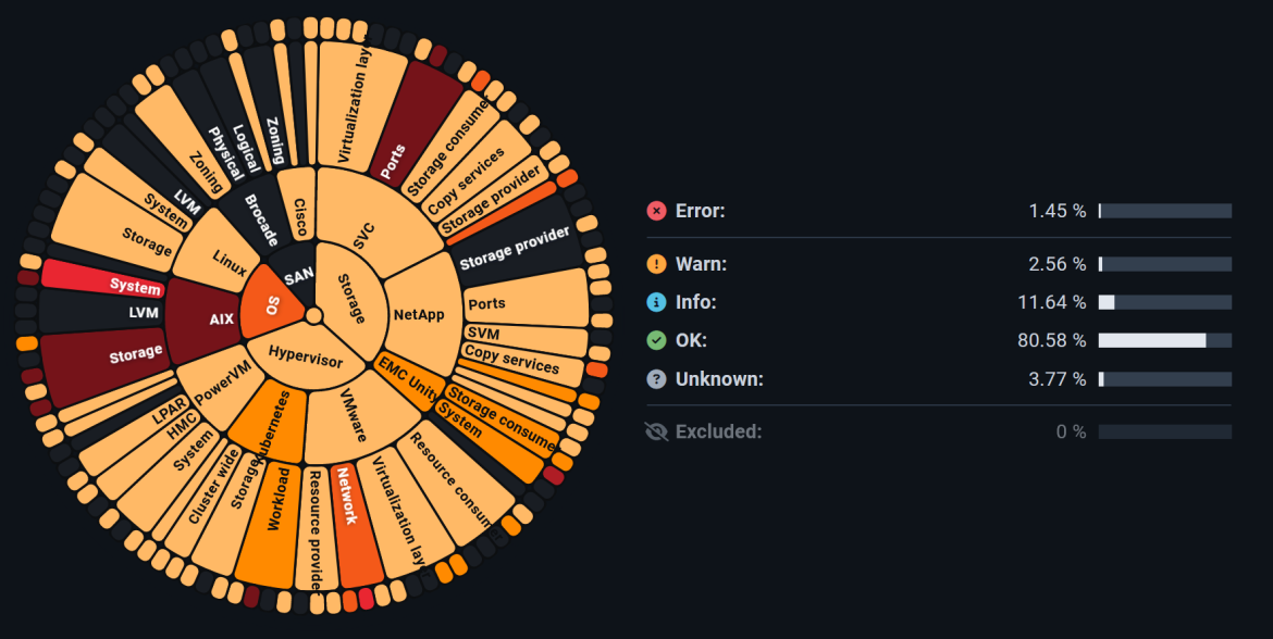
A look at the new System Health Map (SHM for short) reveals a different picture. The previously used colors and messages in red (Error), yellow (Warn), blue (Info) and green (Ok) seem to have disappeared. There is a good reason for this.
The customer survey mentioned in the previous blog article showed that our customers want a presentation that places a greater focus on the problematic areas. This presentation ensures that it is immediately recognizable where action should be taken quickly. The result of this change was the presentation of the SHM in a “weighted” layout, in which the green (OK) status is deliberately not displayed. This gives the user a direct view of the essentials and makes it easier to recognize and weight problem situations.
Furthermore, each individual alert rule has been given a weighting (severity) in the form of a color scheme. With this measure, the groups above the respective rules can be subdivided much more finely in terms of their problems. For example, orange symbolizes “Warning” and red “Error”. The intensity of the coloring provides information about the degree of severity. A deep red color is a clear indication of a problematic situation, whereas a light orange color indicates a problem, but the severity of the problem is not so serious and there is no acute need for action.
However, if the respective user prefers the previous display to the current one, it is still possible to switch to the old version. The setting is made under “Chart coloring” between “Weighting” (new logic) and “Alert levels” (“old” view).
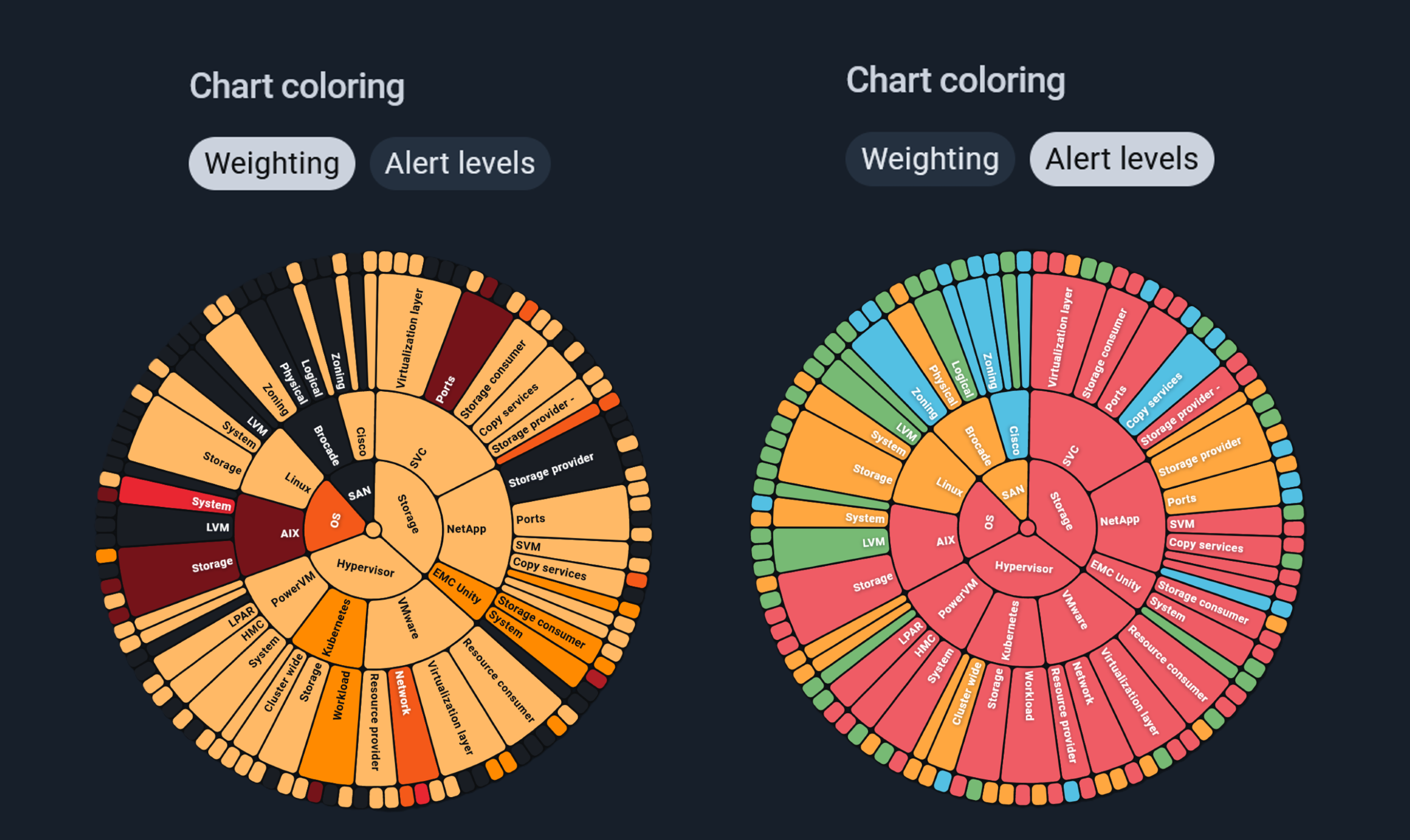
Fig. 1: Difference between the display options according to “Weighting” (new) or “Alert levels” (“old”)
HOW TO: THE NEW ALERTING AND BENEFITS FOR USERS
With the implementation of the new UI, the range of functions has not been reduced compared to the previous version. On the contrary: new features were introduced and integrated in a UX-compliant manner so as not to overload the display unnecessarily.
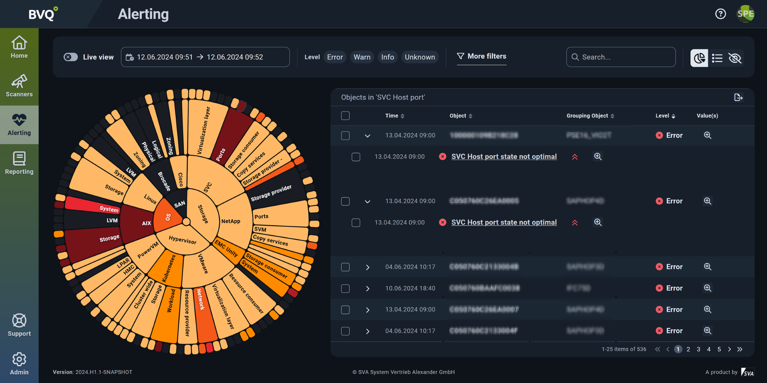
Fig. 2: Alerting view with weighted display of the System Health Map
The new alerting design within the BVQ° UI is divided into three main areas, as highlighted in color in the following illustration:
- The green area contains the setting options for defining the observation period, the filter options, the use of a search function and the SHM as a table.
- The blue border shows the SHM itself and its design depending on the use of the filter, time period and search algorithms.
- The yellow section represents the set of objects based on the selection of the alert rule.
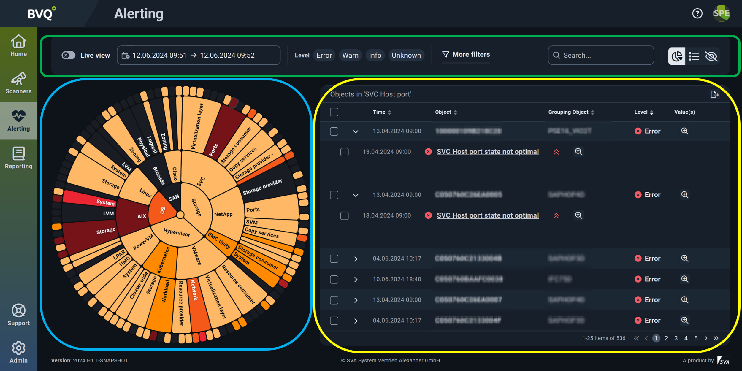
Fig. 3: Focus areas of alerting
TIPS FOR ANALYZING THE DATA

Fig. 4: Target-oriented analyzis options
- The outermost edge of the SHM represents a set of objects, e.g. SVC Node, Cisco SAN or VM Host. In the example above, the set of “SVC Host” objects and their current “health status” is displayed.
- If these objects are also checked in other rules, this result is shown under the object. In this example, the hosts are monitored with three additional rules.
- The weighting of this rule or the rule result is displayed with the following symbols:
High
- = Medium
Low
- The "magnifying glass" symbol shows more detailed information on the respective check
- Clicking on the rule link displays the time history and status of all objects within this rule. The user also receives a list of all objects that are checked with this rule.
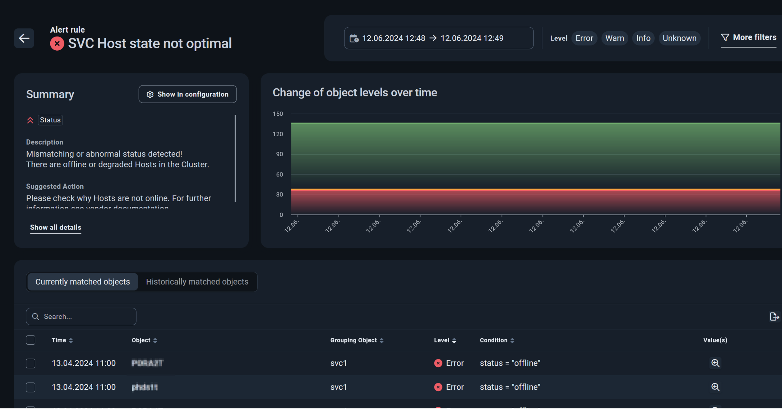
Fig. 5: Partial view of a rule check
CONCLUSION
In conclusion, it should be noted that the introduction of the new color logic has made it even easier for users to monitor their individual IT infrastructure. The ability to prioritize “problem cases” shows at a glance where there is an acute need for action and which points can be addressed at a later date. The resulting ability to prioritize admin tasks ensures more efficient work planning and counteracts system failures even better.
WHAT COMES NEXT?
Many important new functions and options have been added to the BVQ° server. Interested parties can look forward to the next blog articles with interesting details on the following features:
- LDAP integration
- Documentation
- Targeted creation of rules and reports
- Tagging
- Search function in all areas
If you have any questions about the new BVQ° Server UI or the various setting options, please contact us. You can find more details and further blog posts on our BVQ° WIKI.

